Costello & Co.
Rebrand
2025
Luxury, Interior Design, Home Remodelling


Built on care, shaped by detail
Costello & Co. is a women-led, LGBTQ-owned interior design and construction company known for its high-touch, boots-on-the-ground approach. In an industry often defined by formality or exclusivity, their ethos is refreshingly human, blending elevated design with hands-on service, no matter the project size.
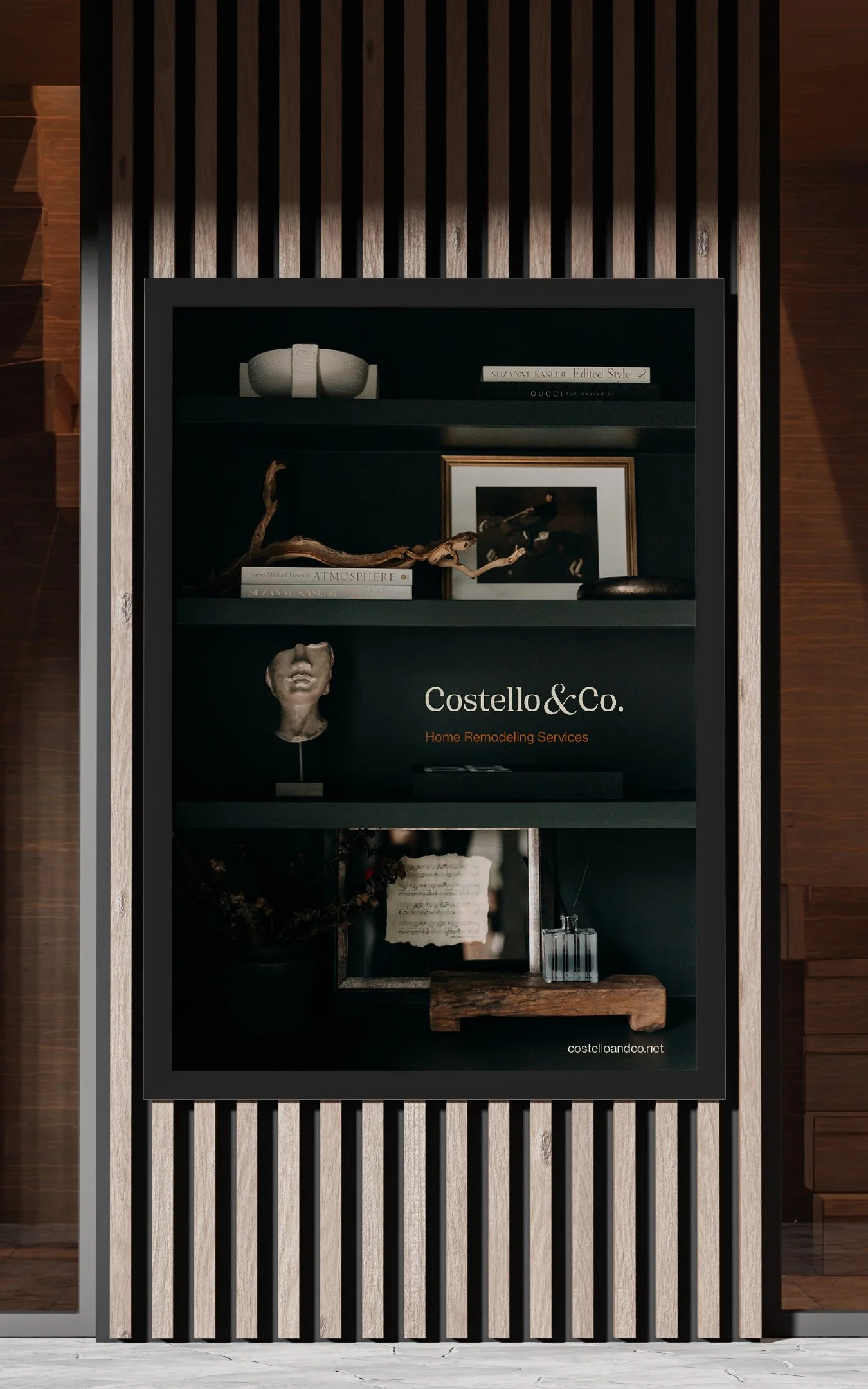
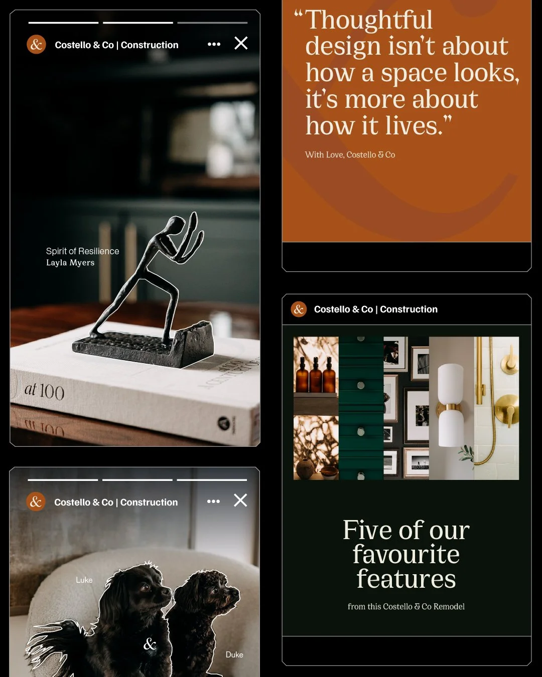
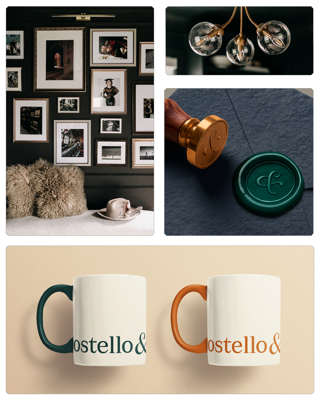
We reimagined the brand around its strongest visual and conceptual motif: the ampersand. A symbol of connection and care, it now anchors a refined identity that mirrors their spaces, layered, considered, and built to last. The double Cs appear subtly within the ampersand, offering a quiet signature for those who know where to look.
-
William Rech: Creative Direction, Strategy, Design
Chanelle Rech: Animation, Design
Shelby Dubin: Photography

1. typographic terminals used in ‘&’ , 2. logo arrangements, 3. transitional typeface vertical stress, 4. original logo, 5. ‘&’ comprised of two ‘C’s

1. primary font Cirka, 2. secondary font Neue Haas Text
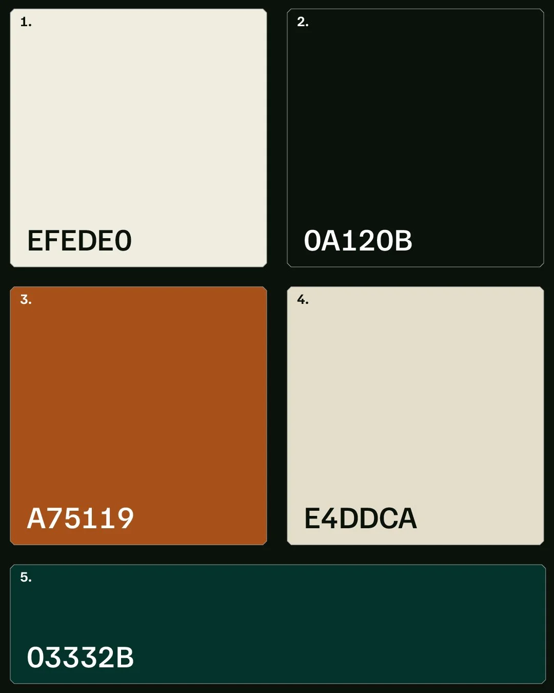
1,2. primary colours, 3, 4. secondary colours, 5. accent colour
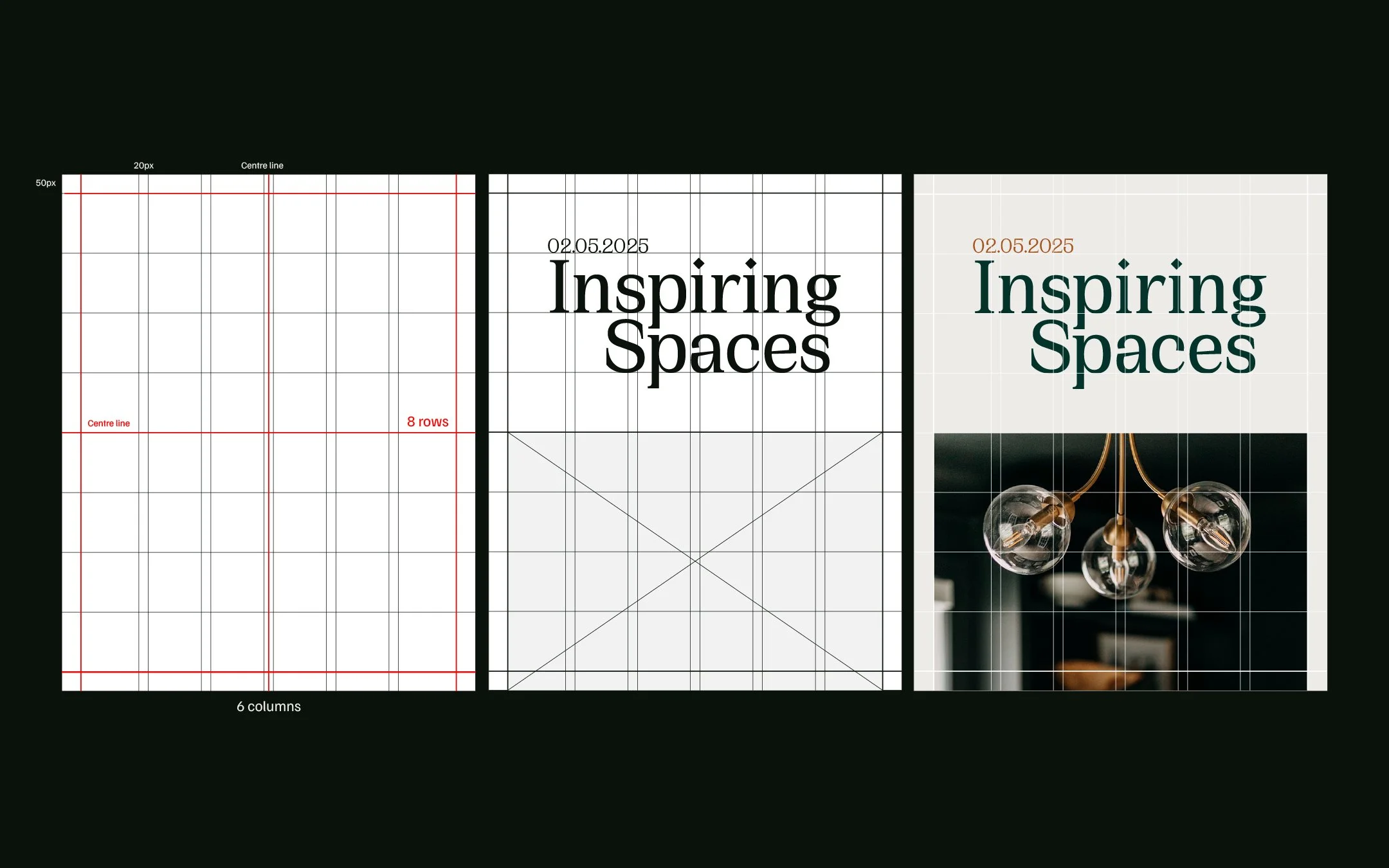
layout grid inspired by the symmetry of transitional interior design style